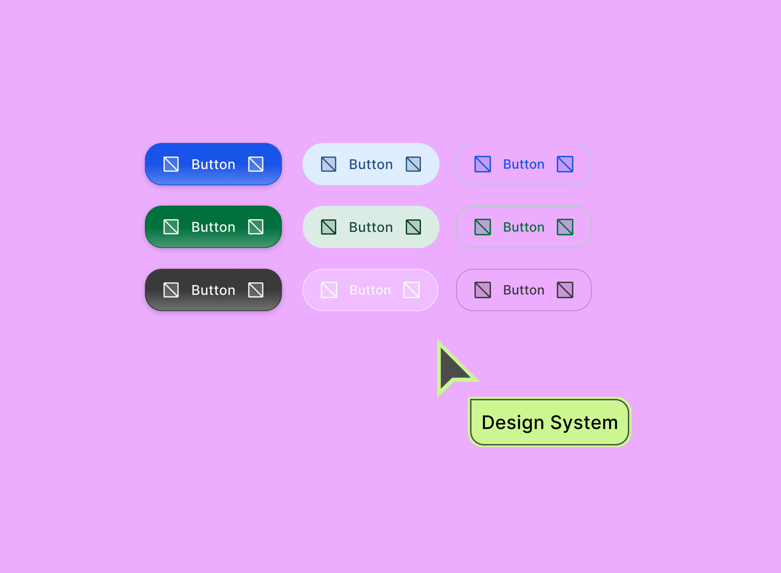
GPTZero Design System Updates
Building a scalable, consistent component library in Figma
Overview
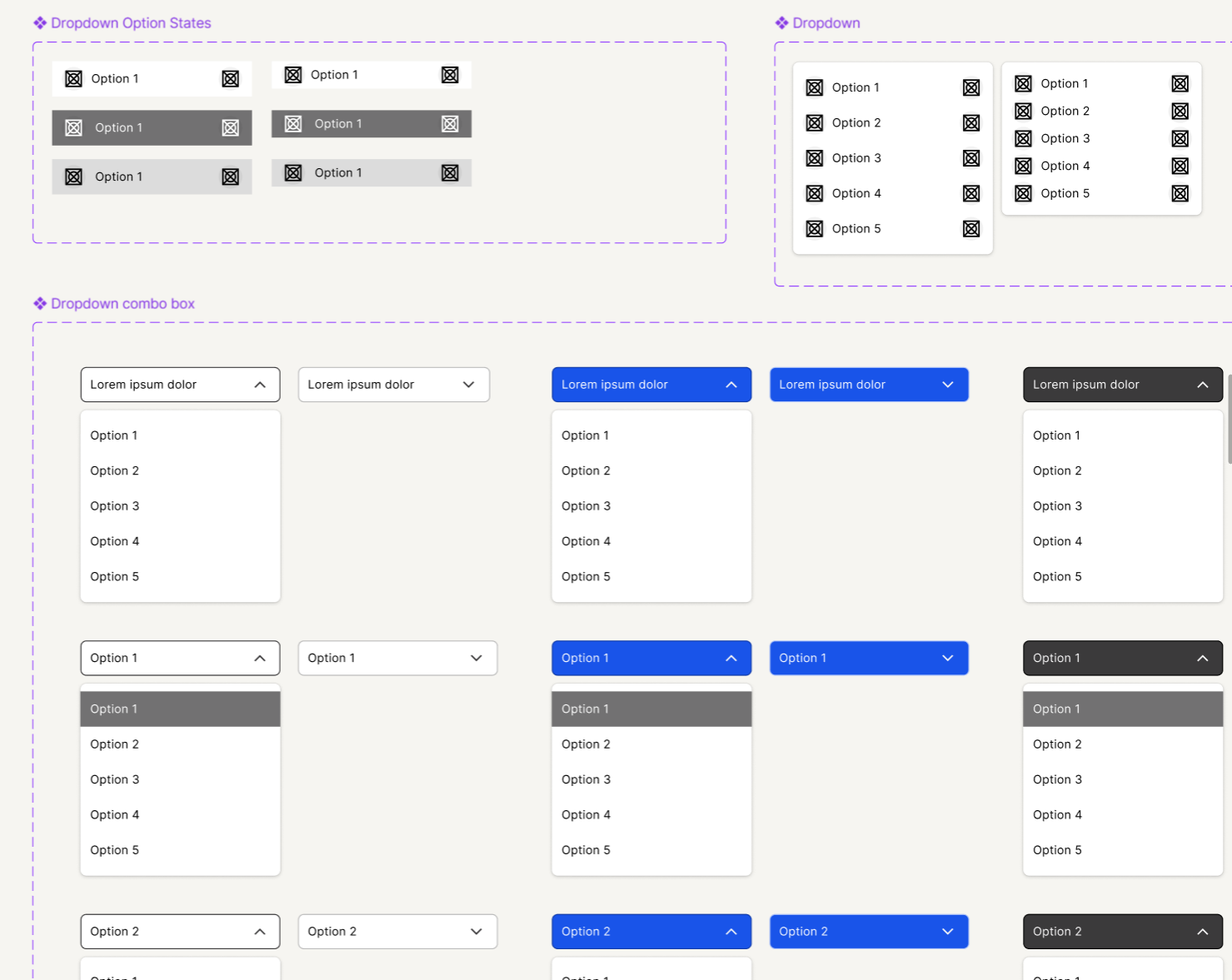
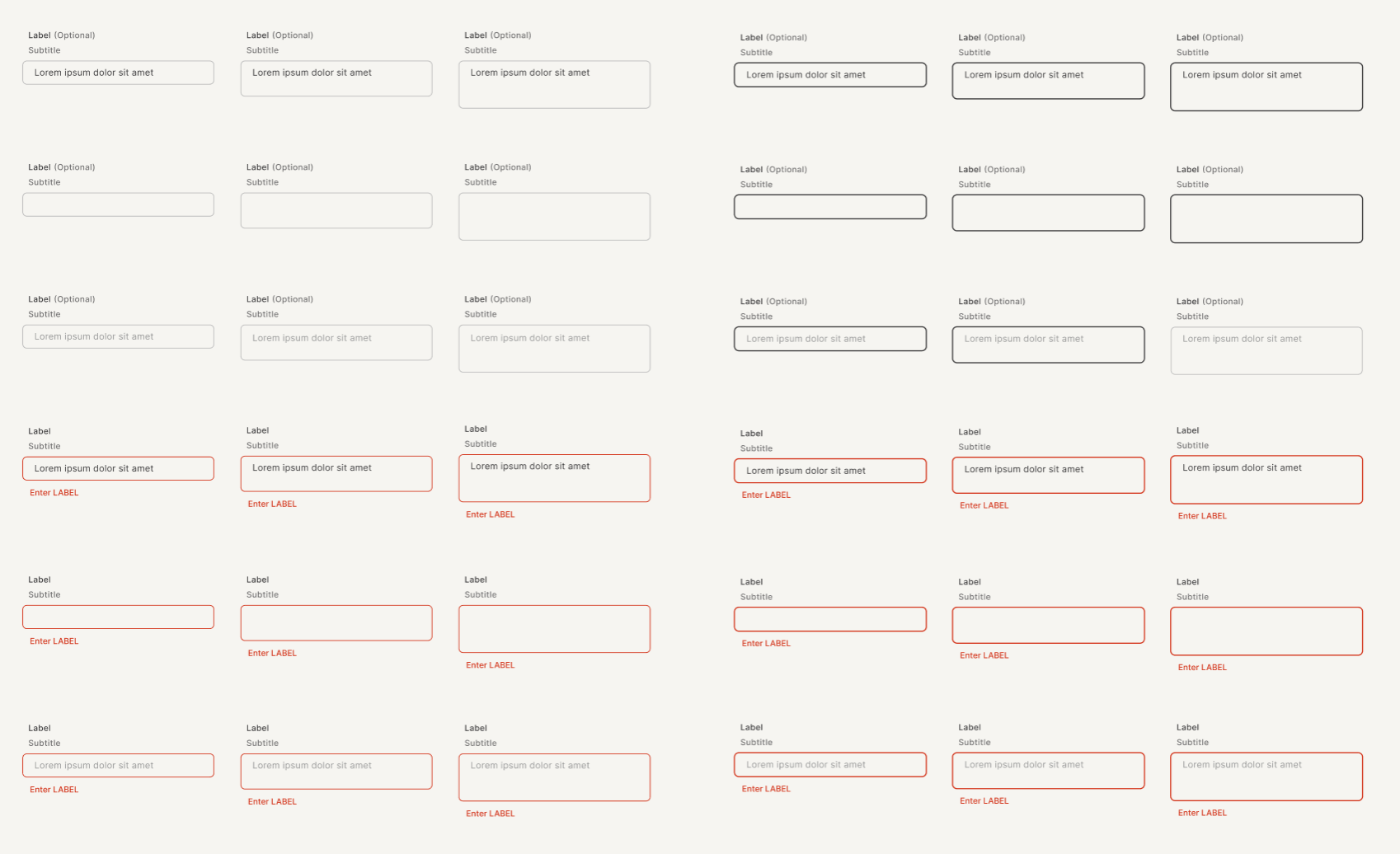
During my product design internship, I worked on updating and expanding GPTZero's design system in Figma. I focused on improving consistency across the website by creating new versions of dropdowns, text input fields, toasts, and buttons. This project emphasized both design detail and system-wide scalability.
Approach
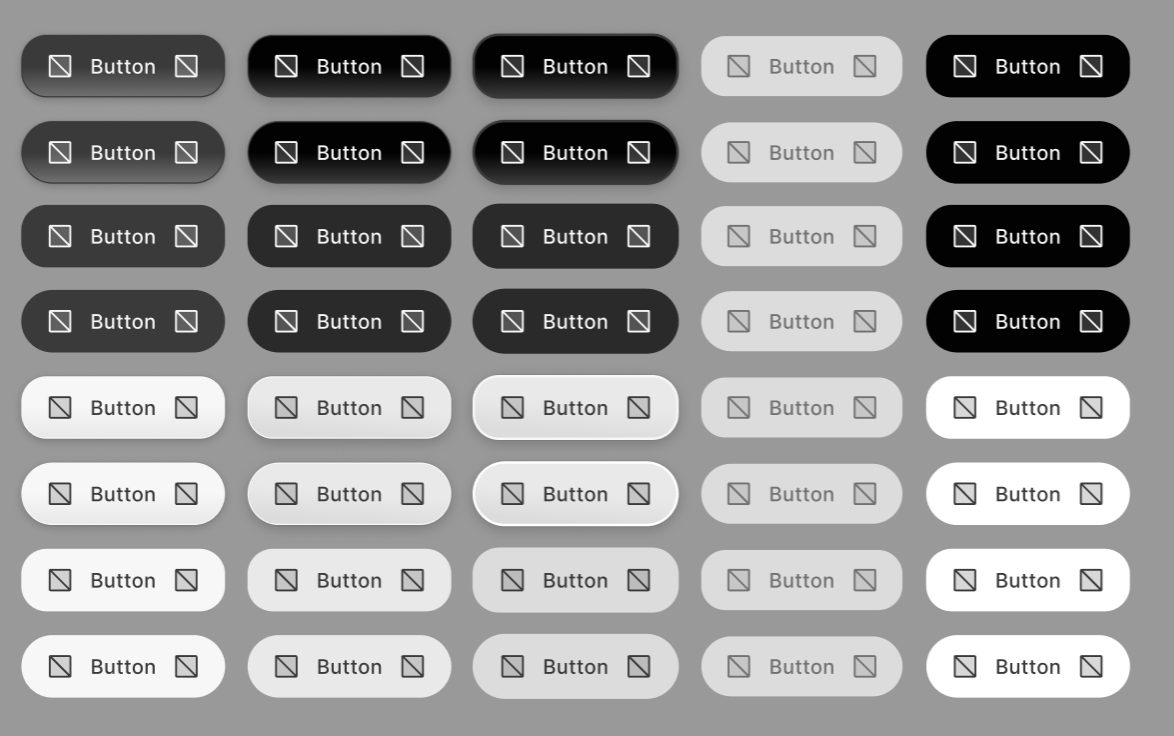
My main task was to refine the button system, which required creating over 1,000+ button variants accounting for different states, sizes, and colors. To make decisions, I audited existing pages and noted where designers had overridden components to create custom buttons.
The existing buttons had a set number of shapes, sizes, and colors, but designers expressed that they often found themselves overriding these to fit specific use cases. Additionally, they expressed a desire for a more cohesive and modern look across the site, starting with the buttons. I worked closely with senior designers to understand their needs and iterated on designs in Figma, testing different combinations of properties to find a balance between flexibility and simplicity.
Major changes:
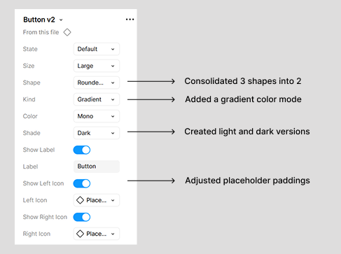
- Updated button shapes to be more modern and cohesive
- Standardized sizes to reduce complexity while maintaining flexibility
- Added hover, active, and disabled states for all button types
- Created new color options and refined color palette for better contrast and accessibility
- Consolidated three shapes (square, rounded, pill) into just two (rounded and pill), reflecting actual usage patterns and simplifying the system.
Key Insights
I learned how to efficiently bulk edit components in Figma and gained a deeper understanding of how small design details scale across large systems. This project sharpened my eye for consistency and usability while teaching me how to balance flexibility with simplicity in a design system.